Mobile App
Melodon
Designing a secure way to manage medical documentation.
The main focus of the Melodon app was taking their existing app model and translating it to something more palatable on the eyes with minor upgrades to the user experience.
When the client came in, the existing Melodon app actually was working. Users could sign in, edit their profile, view their notifications, and see their medical records. My goal was to take this experience and upgrade it visually since the existing app had very barebones design and utilized out-of-the-box mobile technology extensively. The client was eager to see unique ways to accomplish the same experience but with upgraded usability.
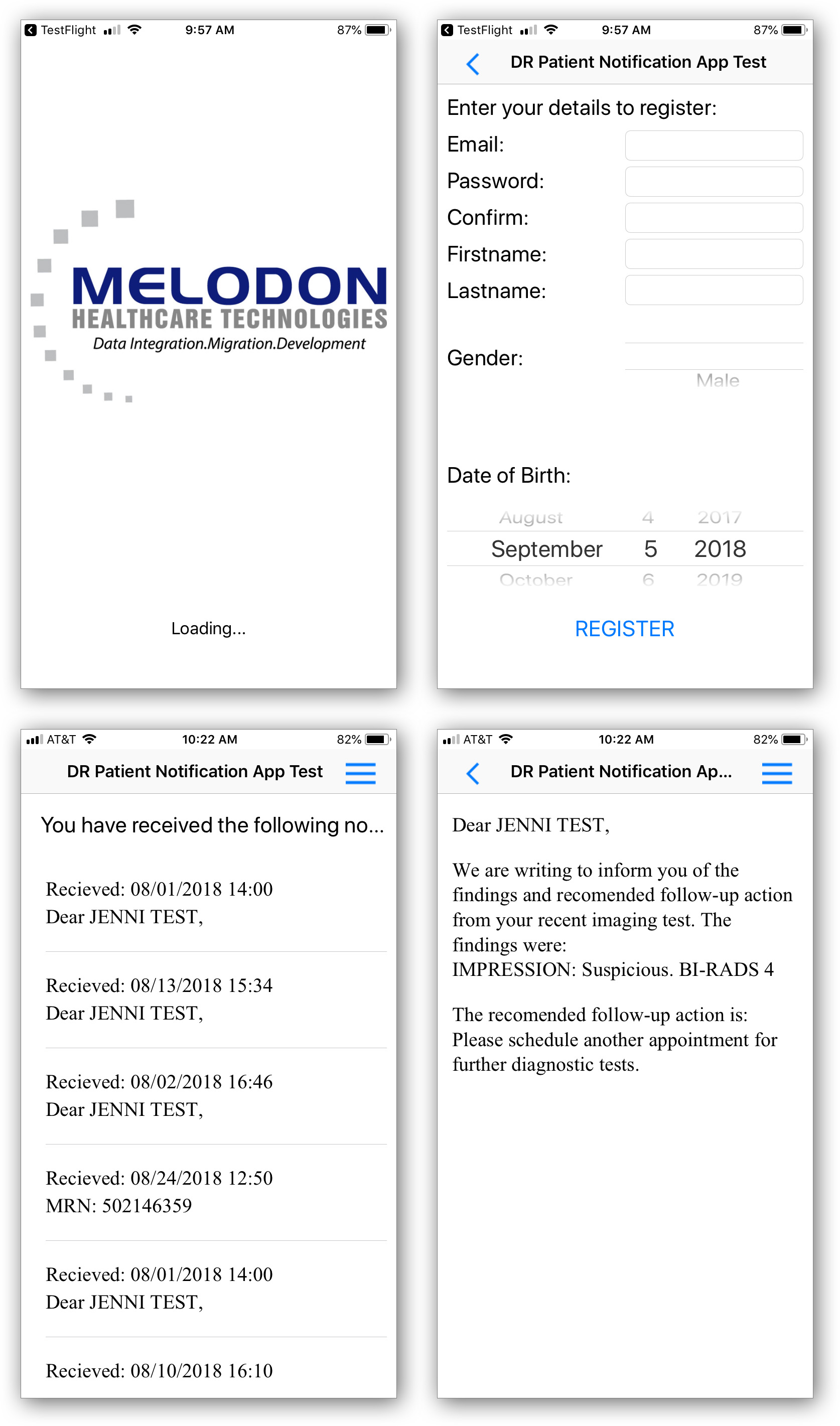
The design for the existing Melodon experience when they first came in featured a very stark and barebone black-on-white design.
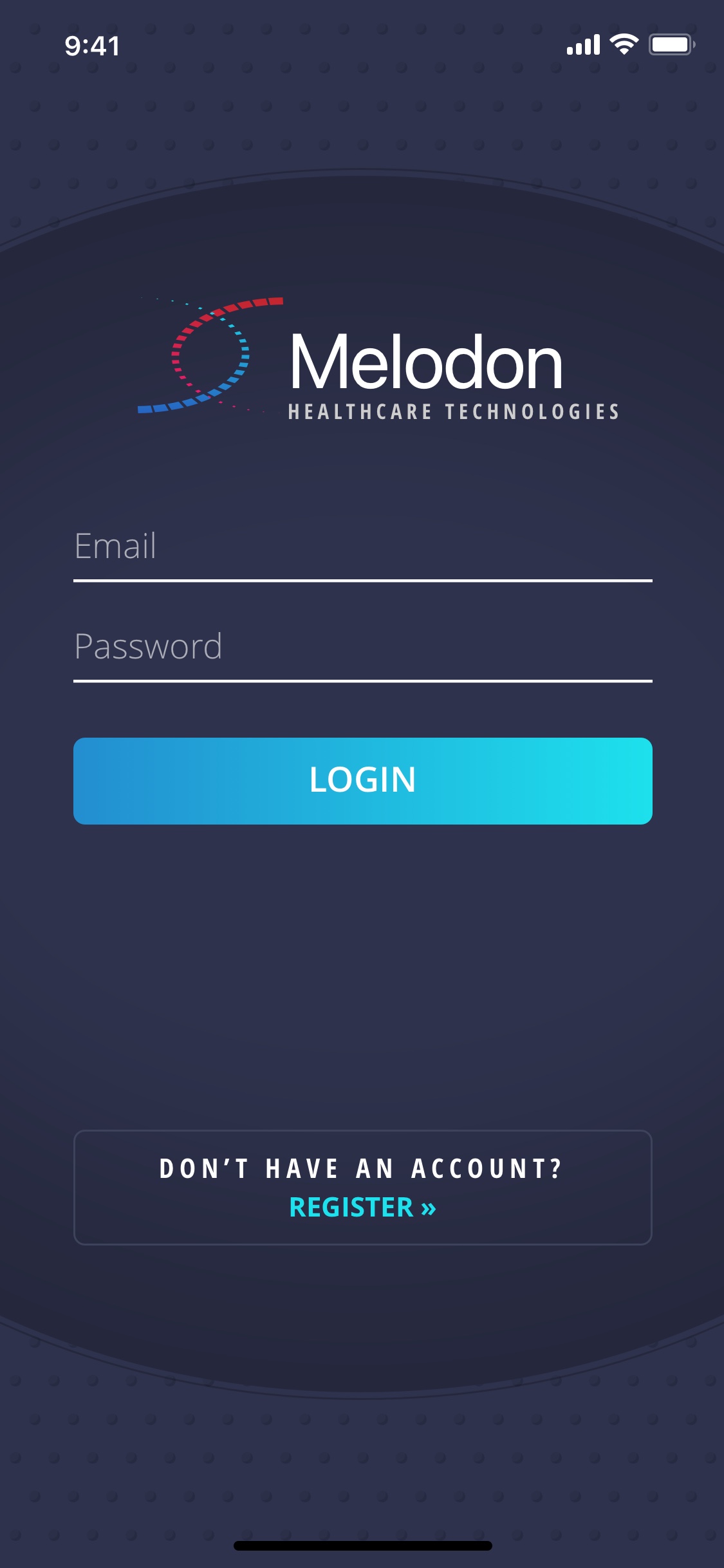
The new design featured an upgraded logo and brand elements that helped to legitimize them as a business and allow their customers to feel safe in the experience.
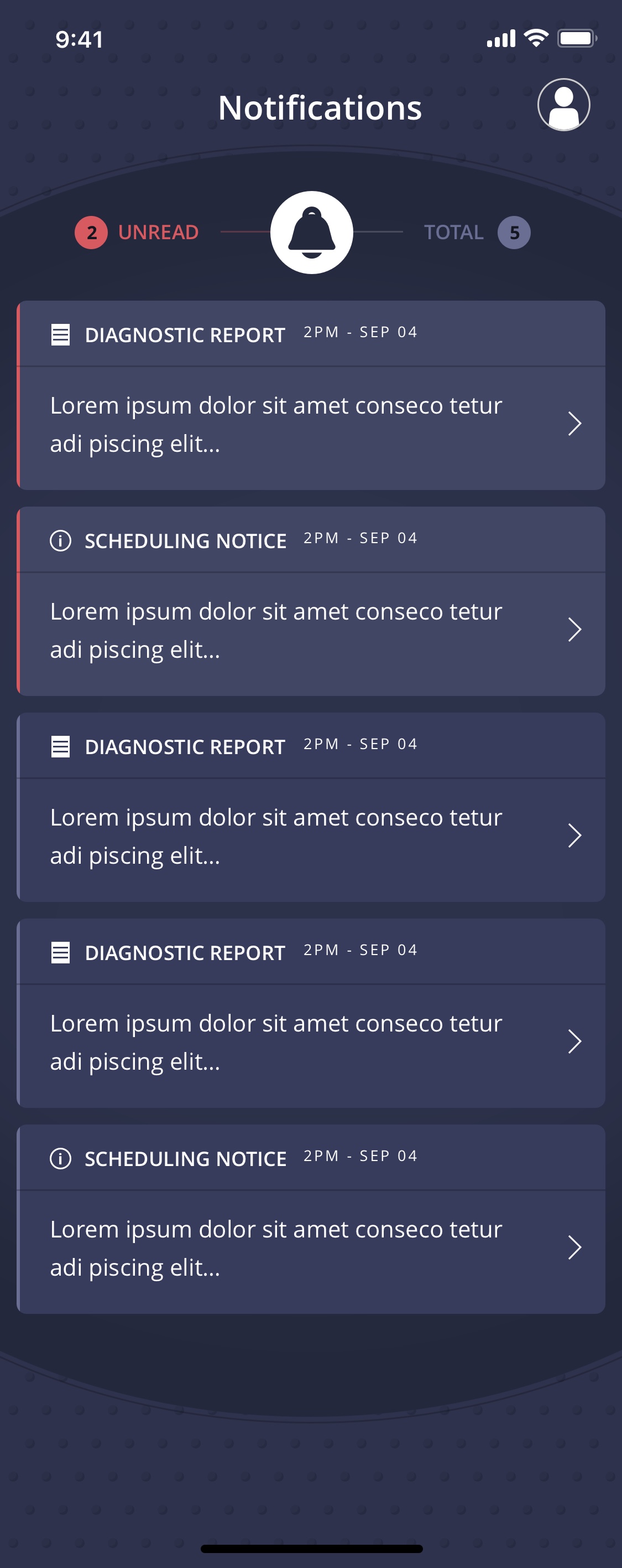
The notifications area was the main landing point of the app and many new features were added to upgrade the app's usability like "unread" and "total" highlights.
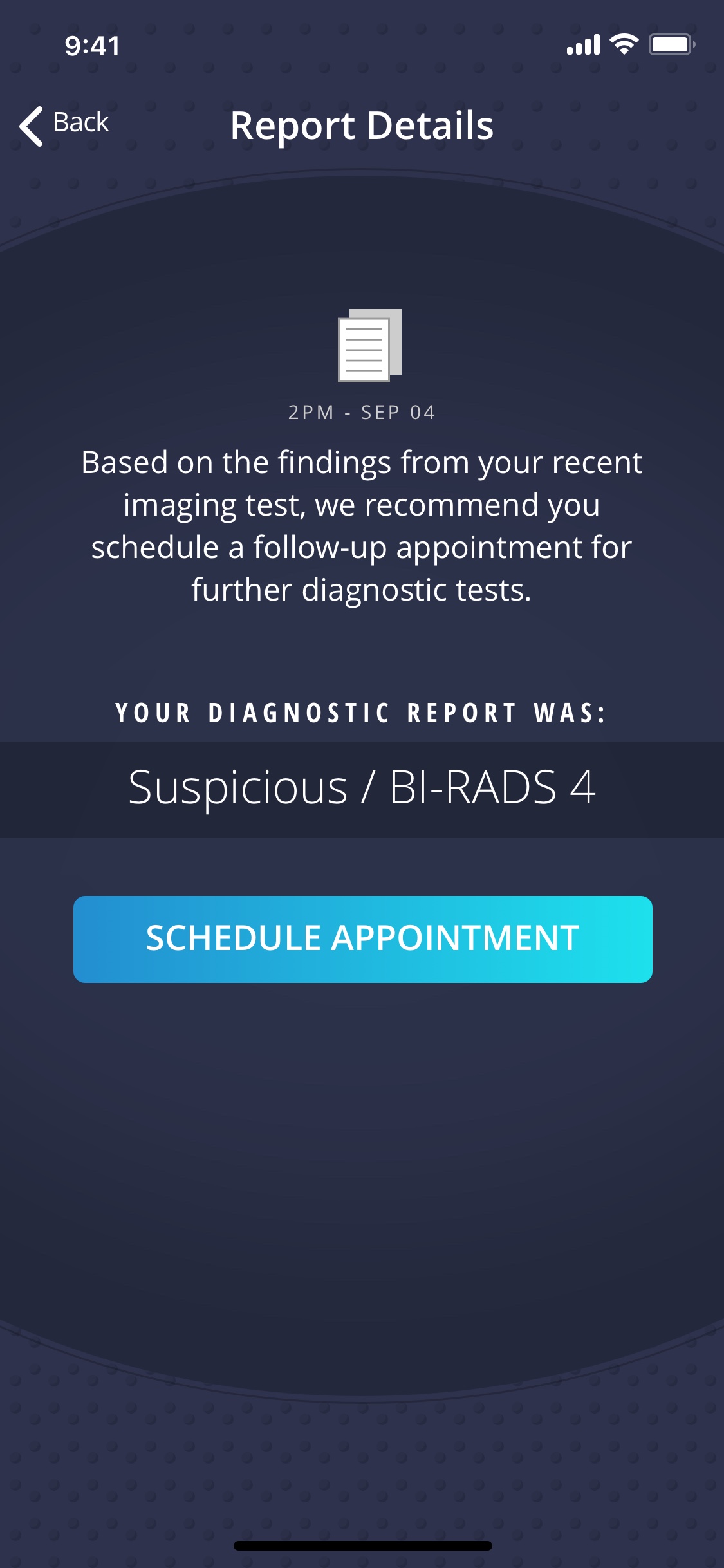
Special icons were created for the app to help communicate the different screens and different types of reports that a user could receive.
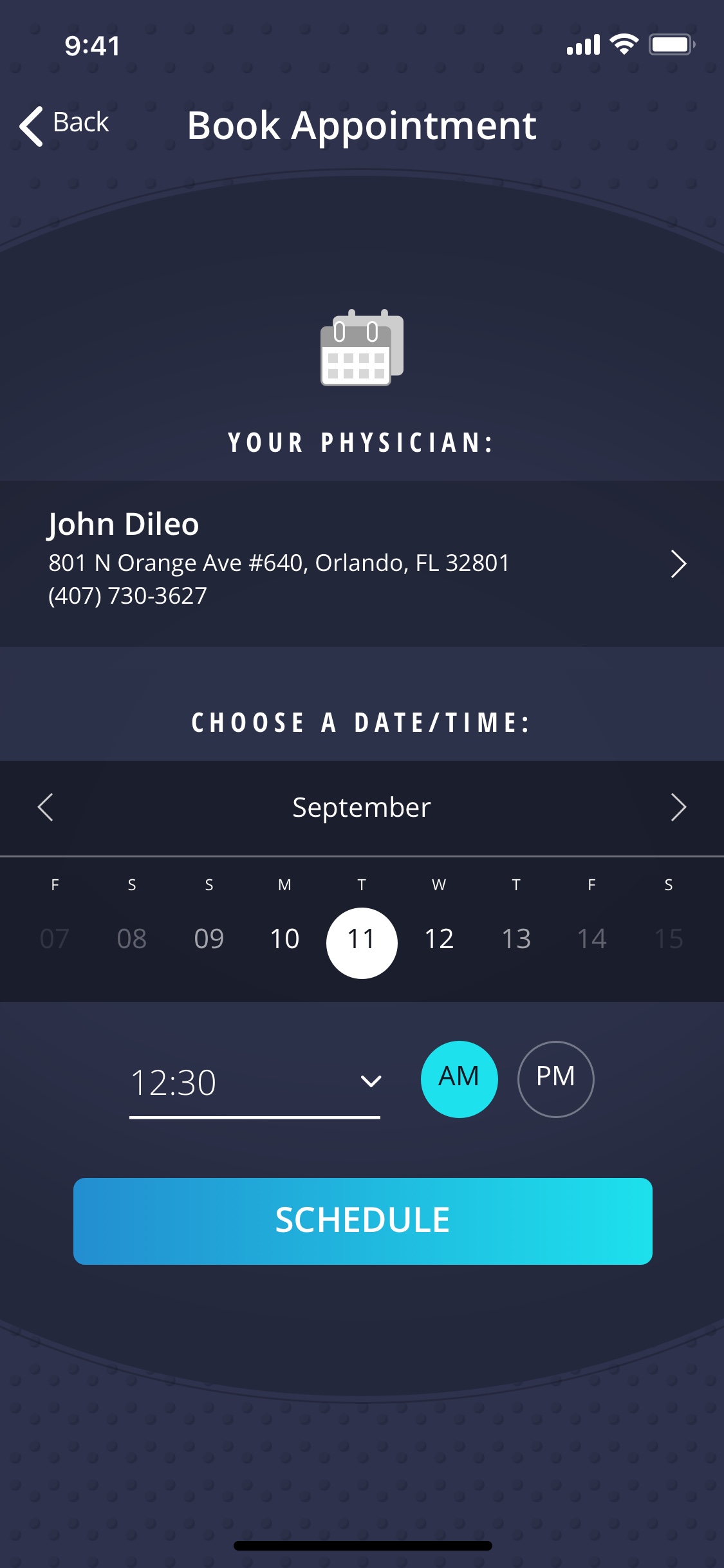
Very unique appointment booking functionality was designed to help the user quickly select an open date and schedule their appointment.
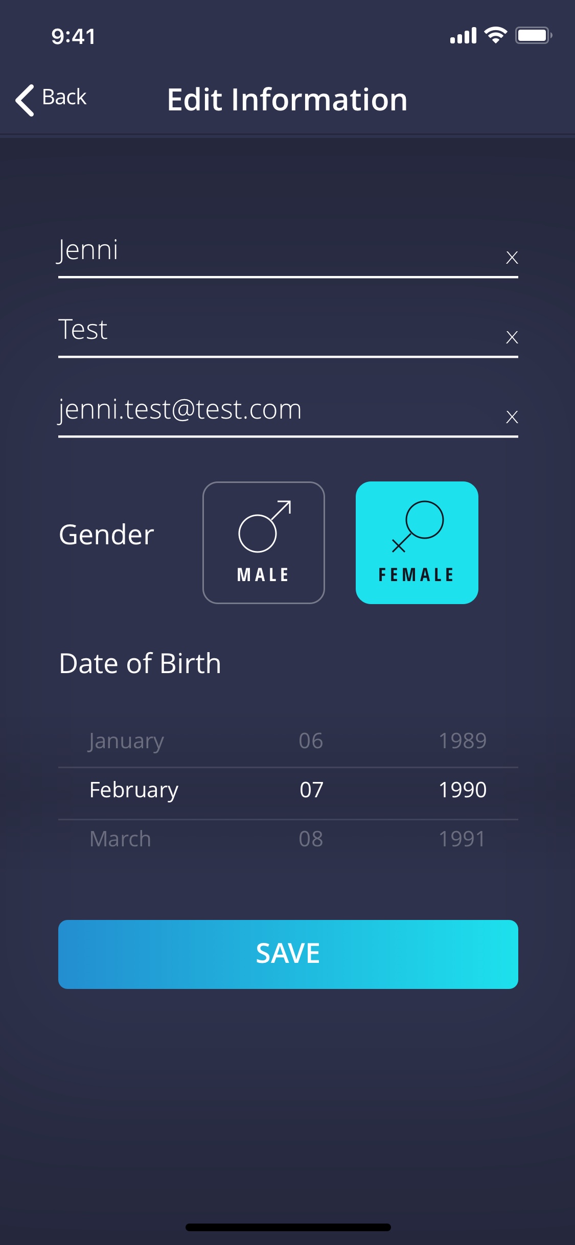
The profile information screen was designed to be easily managed and quickly editable if any information was found to be incorrect.